ShopDreamUp AI ArtDreamUp
Deviation Actions
"Fleshy Features - a substantial serving of Artistic Nude Daily Deviation suggestions!"
A Community Choice feature for deviations I have received as DD suggestions that have not been featured as a DD.
Deviations featured in this article series do not in any way become ineligible to receive a DD at a later date, and do not need to be suggested again. I keep all DD suggestion notes, and go back through them often.
My apologies to everyone for not posting in this series for November. Some "real life" projects, the current AN contest, holidays, and the Groups launch conspired to keep my attention and postings occupied in other areas for these past few weeks.
In conjunction with the current AN contest, "Skin in Color," here is a Fleshy Features edition for nudes in color.
One of the reasons I post these features by themes the way I do is to very intentionally point out some of the commonly used ideas in artistic nude photography.
Sometimes the ideas are used so often they become cliches. Sometimes the inclusion of a known and recognized element helps tell a story or relate a concept, especially if the overall idea is new or complex. But I always encourage artists, including myself, to be aware of the "commonly used devices." We should, as artists, make conscious choices about how and where to practice and incorporate these techniques, and also how and where to break away from the "seen before" and look for new ways that aren't already widely used to convey a visual impression or express an idea.
As artists, it can at times be enjoyable and satisfying to work confidently within in our comfort zone, to pay homage to an artist or work that inspires us, or to create something within a familiar genre/style we know and love. However, I believe that we should all challenge ourselves at least part of the time to step outside and move beyond ideas we have seen expressed many times over.
In the case of this "color nudes" feature, with each image, I have included a bit of description to point out uses of color. Some of the effects are are obvious and simple, while others are complex or more subtle. Take a good look to see how some of these artists have given careful thought to the choices and placements of colors within their image. Such choices can contribute greatly to the strength of an image even through the technique may have been used many times before.
Color in the indoor environment:
Mature Content
 A limited palette of whites, neutrals, blonde hair and pale skin - set off by the strong red color in the wallpaper, yet not overpowered because of the delicacy of the pattern.
Mature Content
 Warm lighting and strong highlights and shadows provide contrast and set mood. The "blocks" of alternating color tone and shadow moving down this image create elements of composition in addition to the physical elements present.
Mature Content
 The cool blue and white scheme of the wall and bedcovers suggest a calm elegance.
Color in the outdoor environment:
Mature Content
 The model's vivid red hair and a vivid red poppy field come together to create a cohesive image.
:thumb139591778: What looks like it could be late afternoon or evening light angles across an environment of cool stone accented by earth tones of leaves, moss, hair, and skin.
:thumb143396221: A silhouette at sunset would never be the same in black and white!
Use of complementary colors:
Complementary colors are opposite each other on the color wheel and "incite each other to maximum vividness when together." (quote from the web site worqz.com.) Each color has an exact complementary pairing, but also a range of tones that fall close by its exact opposite and also create a strong contrasting effect.
Mature Content
 Blue flowers, and a model with red/orange hair against the red/orange autumn trees: A well-planned combination of color between model and setting that makes use of the blue/orange complementary color pair.
Mature Content
 A royal blue backdrop not only adds color interest in itself, but provides complementary color to the model's red hair and red stockings.
Colored backdrops and colored lighting:
Backlighting in the orange glow of what appears to be an abandoned location creates a warm and luminous effect.
Mature Content
 With a setting of a red chair against a matching red wall, the model stands out clearly within an environment that is neither blank nor cluttered. "Red" may have different associations for each viewer, but with its strong presence in the image, it is sure to tie into that set of associations for each person who sees this image.
Mature Content
 Reflections and highlights from the orange of the background create a much different effect than highlighting the model's skin only in white light.
Colorful props and accessories:
Mature Content
 The choice of the dark red fabric as a prop ties into the rusted windmill silo that forms the focal point of the setting.
Mature Content
 Shafts of light break through deep shadows to highlight small areas of deep color in this photograph a la an Old Masters painting.
"Splashes" of color:
Mature Content
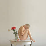 The pale setting and paleness of the model's skin allow the red flowers to become the focal point by virtue of being the single points of bright color within the image.
:thumb126513809: The gold balloon props coordinate to match the golden flowers of the landscape. Blue and gold, while not truly a complementary color pair, still provide a strong set of contrasting colors within the image. Amongst all of this coordination, the splash of the model's bright red hair really "pops" out of the image. You can bet that all of these elements were planned to make this an effective piece.
Body art:
:thumb118605111: Bright multicolored body paint makes this a cheerful and whimsical image.
Mature Content
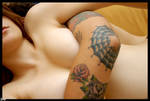 Warm skin tones and the colors of the tattoo art make this portrait intimate and human even within a semi-abstract composition that shows no faces.
Color figure nudes:
:thumb131652040: Even classic high-key figure work in color has a totally different feeling than in black and white. Skin tones and contrasts also hit the eyes and brain quite differently when presented against white versus the blacks of low-key images.
Mature Content
 A classic color figure nude where the contrast is between luminous skin tone and bright highlights on a black backdrop.
Mature Content
 With these two models of contrasting skin tones, the comparison of "black with white" has an entirely different visual and thematic impact presented in natural color than it would in monochrome.
A couple of thoughts about color nudes: In choosing images for this feature, I went back through every single DD suggestion note I have on file that has not already been featured for a DD or in Fleshy Features. I would say about 75% of the suggestions I receive are for b/w or sepia artistic nudes. This is one of the biggest reasons I chose to hold a "color" nudes contest and to take some time to emphasize color nude DD's and features: To promote the ways color can be used in fine art photography, and to help break the "fine art has to be in black-and-white" stereotype.
Just one more quick note: Please continue to include the image thumbnail in every DD suggestion! As you can imagine, I have many DD suggestions on file. When every suggestion shows the thumbnail, I can go back through, sort, and select (such as finding images that fit a feature like this one), from hundreds of DD notes, click by click, in just a few minutes. Thumbnails make it much easier for your suggestion to be seen and featured for a DD or other feature that it deserves. Thank you!
Common reasons for not featuring a suggested deviation as a DD:
(This is not meant to be a complete list, but just some of the most common recurring reasons why a suggested deviation has not been featured.)
**Deviant already has a DD within the past 90 days.
**Deviant already has a large number of DD's.
**Deviation does not meet the criteria of the Photography -> People & Portraits -> Artistic Nude gallery.
A recap of my Daily Deviation Suggestion Guidelines for Artistic Nudes:
WHAT to Suggest:
** Deviations of excellent technical, emotive, and conceptual quality meeting the criteria of the Photography -> People & Portraits -> Artistic Nude gallery.
** Deviations by artists who have not received a DD in the last 90 days.
** Deviations by artists I myself have not already featured for a DD.
HOW to Suggest:
** Send me a note with "DD Suggestion" as the subject line.
** Include the thumbnail of the deviation.
** Include a few words about why you are suggesting this deviation.
WHO to Suggest to:
** Me, OR my co-Gallery Moderator for Artistic Nudes, Nyx-Valentine.
** Please send your suggestion to only one Gallery Moderator.
** I will not respond to every suggestion note, although I keep every suggestion note that I receive.
BEFORE you Suggest:
** Suggesting DD's for Dummies
** How to check any deviant's past DD's
FAQ #511: How do I post thumbnails of my art on the Chat Network or Forums?
FAQ #61: What is a Daily Deviation?
FAQ #18: Who selects Daily Deviations and how are they chosen?
FAQ #873: What do I do when I disapprove of a Daily Deviation feature?
Copyright Infringement Account
~dmGremlin (https://www.deviantart.com/dmgremlin) Stolen Images UPDATE
The deviation of mine that was reposted without permission has been deleted. I don't know if that action was taken by the account holder or by dA. I have no response from dA to my report/DMCA. I only know because I went back to the reposted deviation I had open in a browser tab, refreshed, and got the "oops" message for a page that no longer exists.
The user's account is still otherwise completely intact. So if dA removed the deviation, there doesn't appear to be any other action against the "gallerist" for reposting images without permission. Otherwise if the user removed it, that's cool and all, bu
The more things stay the same...
~dmGremlin (https://www.deviantart.com/dmgremlin) Same Old
All of my reasons for minimizing my involvement in the dA "community" have been reaffirmed.
A Candid View of Nudes on dA
~dmGremlin (https://www.deviantart.com/dmgremlin) Nudes: What People See
I just read a brief but very affecting journal post by Crowtesque (https://www.deviantart.com/crowtesque), an artist I've followed and corresponded with on dA for years. I like her and her art both very much.
Her journal is a perfect case-in-point of why, for a long time now, I haven't felt that dA was a good place for me to post or display art - given that a large proportion of my personal work falls into the artistic nude category.
It is very clear that Crowtesque (https://www.deviantart.com/crowtesque)'s journal is not denigrating nudes as an art form, nor do I feel that her words are in any way personally directed at me or what I shoot.
This isn't about the extr
Nov 2 Lighting Workshop - REPORT!
~dmGremlin (https://www.deviantart.com/dmgremlin) Nov 2 Workshop Report!
Thank you very much to all of the participants in this past Saturday's Artistic Lighting Workshop at D. M. Gremlin Studios - our models, StMerrique (https://www.deviantart.com/stmerrique) and HourglassDeviant (https://www.deviantart.com/hourglassdeviant), and all of our attending photographers! The event was a wonderful success, full of creative exploration, learning, and shooting, and we're already beginning to see some fantastic images posted!
Here's a gallery folder in the group's gallery with more photos from the workshop!
Thanks also to ebenbrooks (https://www.deviantart.com/ebenbrooks) for his enthusiastic writeup and review - he says, "The class was incredible!"
Outside of these occasional special all-
© 2009 - 2024 wynnesome
Comments22
Join the community to add your comment. Already a deviant? Log In
thank you! 